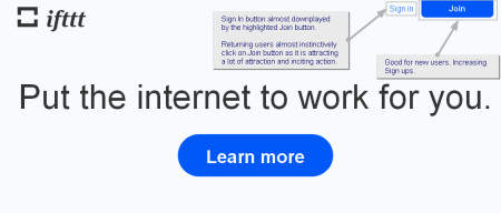
ifttt.com homepage Sign In vs Join UX/UI issue
Join button: Good for new users. Increasing.rnrnSign In button: almost downplayed by the highlighted Join button. rnReturning users almost instinctively click on Join button as it is attracting a lot of attraction and inciting action. (did that several times and realized i'm at the wrong page)
Posted by fursid 2012-01-24 GMT.
 Click to view at full size
Save to disk Click to view at full size
Save to disk
Go to the main discussion: https://easycaptures.com/1666567494
Links to this pictureLink for email or IMCode for site or blog Code for forum (BBCode) Permanent link to the picture |
|